
From Gatefold to Game Box: How Board Game Packaging Became the New Canvas for Graphic Design
- Apr 15
- 3 min read


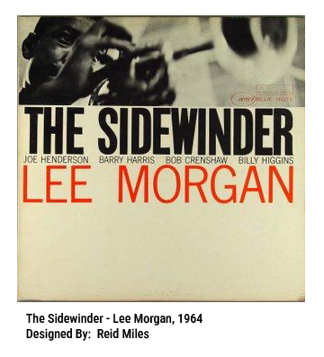

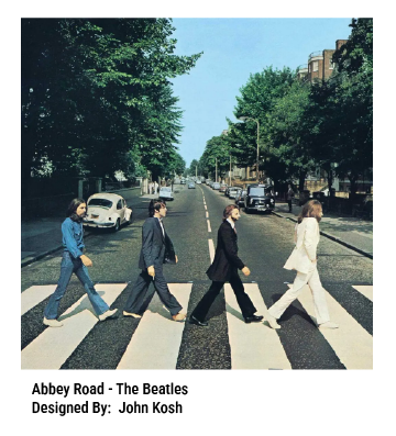

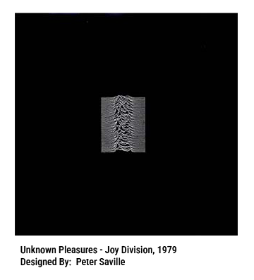

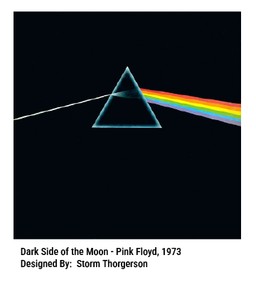

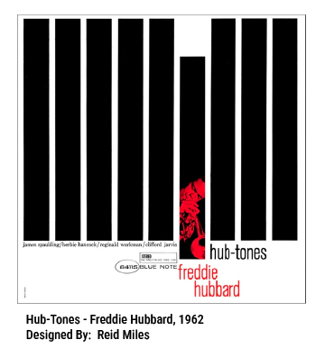
There was a time when the 12-inch record sleeve ruled the design world. From the late 1960s through the early ’80s, album covers were where visual art met mass culture — bold type, surreal photography, and experimental illustration wrapped around vinyl like a manifesto. Designers such as Storm Thorgerson, Peter Saville, and Reid Miles turned packaging into storytelling, making records as much a visual experience as an auditory one.
The devolution of album art from the LP to the J card in a cassette case to the 120x120mm booklet in a CD jewel case to finally the lack of any physical product on which you could put any type of design left designers looking for a new canvas upon which they could leave their mark. Today, that cultural canvas has shifted — from the turntable to the tabletop. In the age of streaming music and digital minimalism, board game packaging has quietly taken up the mantle once held by album art.
The Box as Brand, Invitation, and Icon
A game’s box isn’t just a container; it’s the first moment of play. Its typography, color palette, and illustration communicate tone, theme, and complexity at a glance. A minimalist abstract like Azul signals calm strategy. The painterly chaos of Blood Rage promises cinematic conflict. A publisher’s tentpole IP’s branding can support spinoff games and accessory sales. Just as album covers once reflected a band’s identity, game boxes now broadcast the brand, personality of a designer, publisher, or entire subgenre, linking together in the consumer’s mind seemingly disparate products that allow for a new game to take advantage of an earlier game in a series’ cachet. Games in the Lord of the Rings line or Star Wars rely on powerful design elements to draw players from one game to another.
From Shelf Appeal to Shelf Life


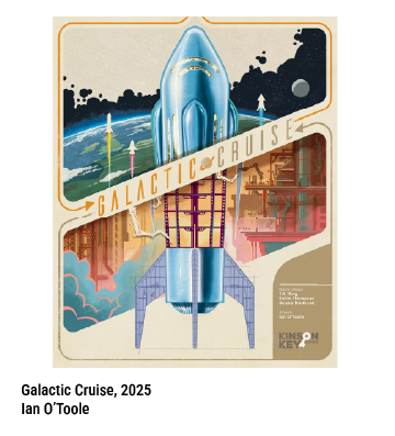


Where record stores once showcased album covers in racks, today’s local game shops line their walls with boxes seeking to dominate the battleground for attention. The emotional connection I make with a game like Galactic Cruise comes from my fascination with the mid-century design language. Designers are pushing the boundaries of printing, embossing, and layout to stand out — incorporating foil stamping, magnetic closures, and wrap-around illustrations that turn storage into art display. Collectors now photograph their “shelfies” the way audiophiles once showed off their vinyl walls.
A New Generation of Design Heroes
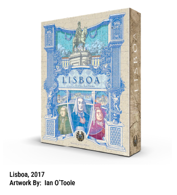
Indie publishers and freelance illustrators have built reputations that rival mid-century album designers. Names like Ian O’Toole (Lisboa), Vincent Dutrait (Robinson Crusoe), and Kwanchai Moriya (Dinosaur Island) have distinctive styles instantly recognizable across titles — just as Warhol’s banana or Hipgnosis’s prism once defined entire eras of music.
These works of art are recognized by not only game industry insiders (BoardGameGeek, Origins, American Tabletop and Dice Tower) but also the larger graphic design community members like Communication Arts and GDUSA. This attention from the broader graphic arts world has propelled some designers into the limelight. Communications Arts' Managing Editor, Michael Coyne, says in an article, “…there are fewer barriers to entry in the world of board games than might first appear, with the relative size of the industry, the number of independent publishers, and the diversity of art styles in games.”
Tactile Art for a Tangible Age
In an increasingly digital world, both records and board games thrive because they exist. They’re tactile, collectible, and social. But where the LP’s visual influence has plateaued, board game design is still expanding — a renaissance of layout, illustration, and print craft that unites nostalgia with innovation.
Today, the humble cardboard box is the new gatefold. And inside it lies not just a game — but the latest chapter in the history of graphic design.
